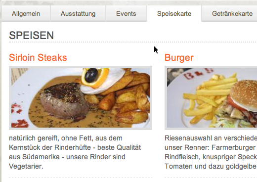
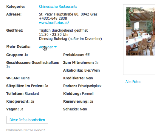
So just to chime in with folks like Roger Johansson and Matthew Inman: Yes, most restaurant websites are a real mess and virtually all of them don’t have the most important information available right where the user is probably looking for it: On the frontpage.
Some of the information I personally see as essential on any restaurant’s frontpage would be…
- Address (perhaps with a link straight to Google Maps or something similar that also works on mobile devices)
- Opening hours
- Phone number or other means to make a reservation
- Payment options (can I pay with CCs, Maestro or just with cash?)
This doesn’t mean that I don’t want to know about the latest offers or see pictures of venue (as on brot-spiele.com) there, but it is not like these bits of information take up all that much real-estate on the frontpage.
But let’s look a little beyond the frontpage, say, at the menu. There are tons of ways restaurants present their menu. Most offer them as PDF, some using very simple HTML and I’m pretty sure there are also quite a few restaurants out there that just offer their menu deeply embedded into a Flash movie. From a restaurant owner’s perspective going with a PDF is probably the easiest way. You most likely wrote the menu in Microsoft Word or something similar in the first place so printing to PDF isn’t really a lot of work. But please, at least try to make the PDF as small as possible. Usually I just want to take a quick look at the menu to see if there is a broad selection of meals, something that usually keeps me occupied for no more than one or two minutes. If your PDF takes only half of that time to download, I will most likely just look somewhere else …

Back to the list of must-haves from before: Something that again has to be really complicated since only very few sites do it is to display prominently how I can actually pay after a hopefully pleasant evening. I’m still always surprised when I can’t pay with a CC or Maestro card and luckily the whole issue could always be resolved in the past. Still, it would help me quite a lot to know in advance about the available payment options so I could make a small detour to the next ATM ;-)

To some degree this additional information is provided by sites like Qype but when I want to see if I might like a new place to eat, these directory sites are usually not my first stop.
Oh, and just one more thing: Restaurant sites really need some kind of mobile version … meaning it should at least work on my iPhone. So please no more pure Flash sites, thanks :-)

Do you want to give me feedback about this article in private? Please send it to comments@zerokspot.com.
Alternatively, this website also supports Webmentions. If you write a post on a blog that supports this technique, I should get notified about your link 🙂