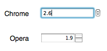
HTML5 (or HTML “the latest version”) offers a couple of great new input fields for your forms and slowly but steadily browser vendors offer custom widgets for them. One of them is the number-field. It’s once of these new fields that also received a custom widget from Opera and Webkit/Chrome, but sadly you can’t really style the Opera widget right now.
OK, and since I will once again write far too much text for this simple issue, here the tl;dr version of this post: I like native widgets, I hate it when I can't override them, but if I can't override them, I'll try to live with them and not go back to text-input fields.
The first thing I thought when I saw the number input-type was: “Oh boy! Finally something for clearly manipulating the number of items in a cart!” Sure, I have a bit of an e-commerce background so most people probably thought about something else when they saw it for the first time, but this was mine :-)
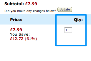
If you’re not sure what I’m talking about, it’s the little “quantity” field you see on every shopping basket page or on the product page of any online shop right next to the “add to cart button”

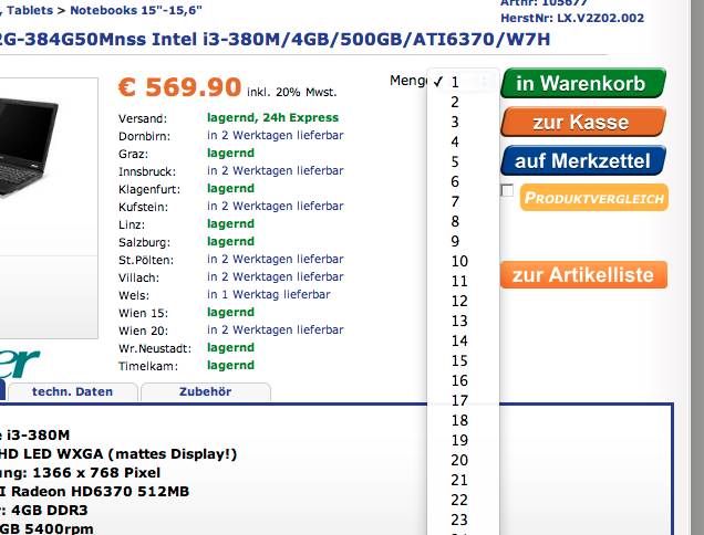
Previously you would have used either a simple text-input field or a select-box with a reasonable upper and lower limit on the quantity a user should be allowed to purchase. Some shops - like e-tec.at - take it perhaps a bit too far by providing a select-box with values from 1 to 200 in it.

The number-input field adds a bit more semantic to the mix thanks to (1) it only allowing numeric input and (2) it providing maximum and minimum value limits.
<input type="number" max="1" min="10" step="1" />
Some shops also put little buttons right next to this kind field to increment and decrement the value. Since this is rather common I wasn’t really surprised when I saw the first implementations of native widgets for this new field-type popping up, with Opera and Webkit leading the way.

But this is also where the trouble starts. So the problem right now is, that if you for some reason don’t want the little spin buttons right next to the input field, you can get rid of them in Webkit with this little piece of CSS:
	input::-webkit-outer-spin-button,
	input::-webkit-inner-spin-button {
	    -webkit-appearance: none;
	    margin: 0;
	}
… but if you also want to get the same rendering in Opera you’re pretty much out of luck. Opera to my knowledge right now doesn’t really offer any way to hide these spinners so that you can implement your designer’s dream-plus/minus button. So what can you do?
- Fall back to a normal text-input field
- (Insanity warning) Place some div or other element right on top of the spinner
Please don’t get me wrong, though. I’m all for browser developers providing native widgets where they can fine tune the usability and accessibility aspects of the new fields. One the other hand, there has to be a way to get around these native widgets. If you’ve ever had to implement a design that feature some non-standard file-input widgets you probably still feel the pain right now ;-)
OK, back to the workarounds and let’s ignore the second option, but what about the first one? What do you really lose if you fall back to <input type="text"> here? Depending on your application this might be a totally valid solution, but it has its drawbacks if you are using the new client side form constraints provided by HTML5 and/or frameworks like jquery.tools.Validator. In this case you’d have to replace the native number validation with a simple pattern for the simple cases and a bit of JavaScript to cover the more complex ones where you want to use for instance the step-attribute.
On a side not: Right now, Opera doesn’t really support actual constraint checking on number inputs but at least some validation frameworks solve this issue and I really hope that Opera will get around adding actual input restrictions eventually here :-)
Since I really don’t want to do the whole constraint checking by myself and/or role out custom implementations for Opera just for the fun of it - and yes, I know that Opera only has a very small market share on the Desktop, but I still like it; and yes, I really hope that Opera will eventually add value validation to this field - I will probably try to convince clients (or more likely designers for that matter) that they should at least give me the option to use the native widgets where available. And if they really must then let me at least fall back to the native widgets where there is no reasonable way to style them. And I don’t count re-implementing validation logic into the whole “reasonable” section, thank you :-)
So for projects where Opera is not on the “pixel-perfect” list (as much as I hate those lists, they are sadly still part of reality right now) I will from now on most likely just use the semantically most correct input type available with the native widget for Opera and show those extra non-native widgets where possible for everyone else (incl. Webkit if I really have to).
In case I totally missed a way to remove those buttons in Opera I’ve opened a topic on their dev forums. But this whole issue goes beyond the number input. For instance jquery.tools.dateinput offers a custom widget for date input based on <input type="date"> which right now replaces the original input element no matter if the browser actually already supports some kind of native widget. Perhaps I’m again missing something but there should really be some standardized way to manipulate native browser widgets…

Do you want to give me feedback about this article in private? Please send it to comments@zerokspot.com.
Alternatively, this website also supports Webmentions. If you write a post on a blog that supports this technique, I should get notified about your link 🙂