A week ago Evernote released a major update for Skitch, a product they had acquired about a year ago. Previously I had already wondered what was going on on that front giving the lack of major new features except for some better integration with Evernote itself. Sadly, Skitch 2.0 turned out to be more and at the same time way less than I had expected of such a big version jump.
Evernote and nowhere else
What Evernote had done was rework the whole UI and most of the features that made Skitch special in the first place and giving the whole app a new focus: Integrating screenshots with Evernote. Previously exporting to “the elephant app” was just one many storage options for your annotated screenshots, but with 2.0 only it and the file-system remain. Gone are things like Flickr upload, FTP upload and so on.
While that caused quite a lot of complains in the official forums, I, personally, didn’t mind that so much. What annoyed me way more was the mandatory nature of the new “all your screenshots now in Evernote” mentality of that app. Basically whenever I take a screenshot of anything it goes into Evernote, something that I don’t really want for work-related stuff. Actually, this was the one change in Skitch 2.0 that made me think about dumping it altogether. You can disable the Evernote export but what I was actually looking for was some kind of simple mechanic that would let me decide what snapshots to upload and what not.
New UI
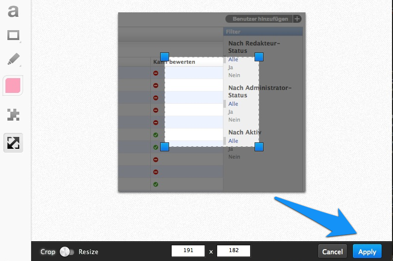
The other big issue the community had was the revamped UI. While the app now definitely looks more modern, it is lacking the playfulness of version 1.0. Previously, if you wanted to resize a screenshot, you just dragged the edge of the canvas inwards; if you wanted to crop the image, you resized the window itself. Now the resizing and esp. the cropping is cumbersome since you first have to make a selection and then have to explicitly hit an “apply” button in far corner of the window.

Personally, I’d have preferred if simply double-clicking the selected region would have applied the cropping.
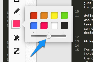
But also all of a sudden features are missing that kind of have nothing to do the simplicity of the UI. Like why are there only 3 lines sizes anymore?

The changed all in all were that severe, that I didn’t find a single person who liked version 2.0 when browsing the Evernote forums of the looking the official blog’s comments.
The update
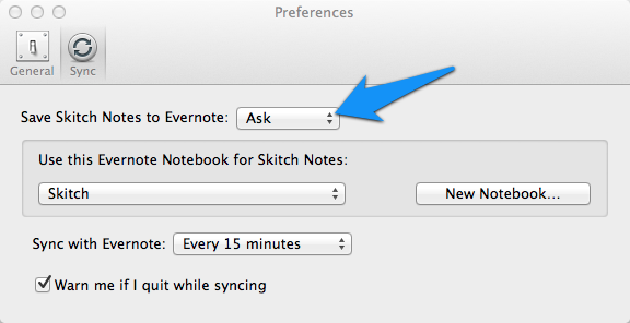
Luckily, it seems like that whole outcry helped and Evernote released version 2.0.1 yesterday with significant changes. For one, you are no longer forced to upload everything or nothing to Evernote. Instead you can now configure that nothing is saved as note until you hit a “save” button.

There was also some work done with the screen-selection mechanism: Since 2.0 you do a crosshair-selection and then a confirmation box pops up. Now the “capture” button (“confirmation button”) is put right below you mouse cursor. Nice touch :-)
It is now also finally possible again to export screenshots as png, jpeg, gif, tiff or bmp. Not that I see the point of anything beyond PNG and JPEG, but anyway ;-)
The future
I really hope that Evernote gets their act together on this one. 2.0 was just a huge blow to their public image. I didn’t really draw any connections to the main Evernote product (for which I have a pro account) but quite a few people did and to some degree quite rightly so. 2.0 was a disaster but it seems like the team at Evernote did the right thing and is now working very hard to make the tool functional again :-)
Personally, I can’t want to see a 2.1!

Do you want to give me feedback about this article in private? Please send it to comments@zerokspot.com.
Alternatively, this website also supports Webmentions. If you write a post on a blog that supports this technique, I should get notified about your link 🙂