I’ve now been a happy Unread user for 6 months but yesterday evening I thought it might be time for a little change in scenery once again. So I downloaded Lukas Burgstaller’s Fiery Feeds app after hearing a bit of buzz coming from MacStories and gave it a try.
Just to get this out of the way: This has nothing todo with Unread. It’s still a very nice and reliable app but I just need to rotate between apps every now and then. So, with that little disclaimer out of the way, back to Fiery Feeds. Since I pay for Unread I won’t distinguish between premium and non-premium features.
Most feed readers have pretty much the same basic feature set: They allow you to organise feeds into folder and to browse through them. The only place where apps can shine compared to others is through polish, customisability, and quality of life features. So while Unread is brilliant thanks to its simplicity, Fiery Feeds offers great customisation options and helpers for people like me who subscribe to dozens and dozens of feeds.
One big pain-point for me usually arrises when I don’t have time to look at my feeds for a day or two. All of a sudden there are more than 1,000 unread items there and it’s hard to browse through all of them. Here, the app offers two highly appreciated quality-of-life features:
- There is a “today” filter that shows you only those items that were authored today. (Premium)
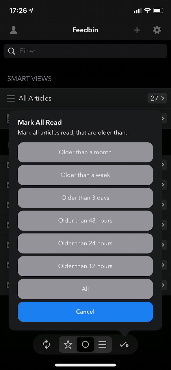
- You can mark “older” posts as read with a simply tap!
I need to elaborate on that second point a bit since the button is hidden by default. You can add it by holding onto the toolbar at the very bottom of the feed-list and tapping on “Customize”. This button now allows you to mark, for instance, all posts that are older than 24 hours as read.

Another highlight for me is the parallax effect when scrolling through a feed where the articles have images. It gives the whole feed a slight 3D effect which is just beautiful!
Fiery Feeds isn’t perfect, though. There are two things that could be improved:
- There are currently no widgets for iOS 14 yet.
- It seems not to be possible to disable the in-app browser which opens when tapping an item’s title
These are only minor issues, though. Let’s see if I will also convert the trial into a yearly subscription at the end of next week. Heck, € 9,99 per year is more than fair for what is offered. In the end I might just have two subscriptions 😂

Do you want to give me feedback about this article in private? Please send it to comments@zerokspot.com.
Alternatively, this website also supports Webmentions. If you write a post on a blog that supports this technique, I should get notified about your link 🙂