
I’ve wanted to play around with CSS grids for a long time ever since I noticed them landing in Firefox. Now, 3 years later I finally got the chance while implementing the photo page here!
What is CSS Grid?
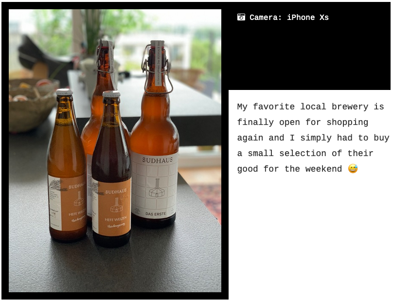
It’s a relatively new CSS feature that allows you to position elements inside a parent element in a table-like manner. Let’s take the photo page as an example:

Here I have a very simple grid with 2 rows. The first row contains only the photo itself while the second is split between the caption and some meta data (i.e. what camera and lens were used to take the picture). The markup looks like this:
<figure class="photo">
  <div class="photo__image">...</div>
  <figcaption class="photo__caption">...</div>
  <div class="photo__camera">...</div>
</figure>
CSS Grid now allowed me to just define that the .photo should be displayed as a grid with 3 cells as described above.
.photo {
  display: grid;
  grid-template-areas: "image image"
                       "caption camera";
}

.photo__image {
  grid-area: photo;
}

.photo__caption {
  grid-area: caption;
}

.photo__camera {
  grid-area: camera;
}
In the example above I use the, in my opinion, most intuitive way to declare a 2x2 grid: the template-areas syntax. Every string defines a row and every cell is defined by a word in that string. If a cell should span multiple rows or columns, you just repeat them in that axis.
This is but one way to declare a grid. You can also define them numerically:
.photo {
  display: grid;
  grid-template-columns: 50% 50%;
  grid-template-rows: auto;
}

.photo__image {
  grid-row: 1;
  grid-column: 1/3;
}
Using area names is more readable IMO and so I’ll stick with it for now.
But how can you specify that one column is wider than another? I’d really like, for instance, that the camera-box is only half the width of the caption-box. I could simply give the .photo__camera column a width of 33% but isn’t there a “grid-native” way? Sure, I could convert the whole grid into a 3x2 grid ("image image image" "caption caption camera") but there has to be a cleaner way 😉
Column/row dimensions with area names
There is, and you’ve already seen it: the mighty grid-template-columns property! Since we are talking about thirds here, I’ll also use a rather new length unit introduced at the same time as CSS grids: The fr or “fraction”. We are now talking about rows with two columns: The first taking up two fractions and the third using a single fraction: grid-template-columns: 2fr 1fr. Area names are just an overlay and can be combined with grid-template-rows and columns.
Reordering
The main reason why I wanted to use CSS Grids for this particular page was that I wanted to see how to re-order elements depending on the content type. There are two kinds of photos: landscape and portrait. For portrait ones (height > width) I wanted to have the image on the left side, the camera on the right at the top and the caption below:
All that I have to change for this, is the one grid-template-areas definition:
.photo {
  grid-template-areas: "photo camera"
                       "photo caption";
  grid-template-columns: auto 33%;
}
This is working quite well so far. I haven’t yet seen the downsides of CSS Grids and I’m pretty sure there are some other than support for older browser. That being said, I’m happy enough with how the photo-page has turned out that I will probably try to apply what I’ve learnt with it onto other areas of the site and also other projects 😅
Do you want to give me feedback about this article in private? Please send it to comments@zerokspot.com.
Alternatively, this website also supports Webmentions. If you write a post on a blog that supports this technique, I should get notified about your link 🙂